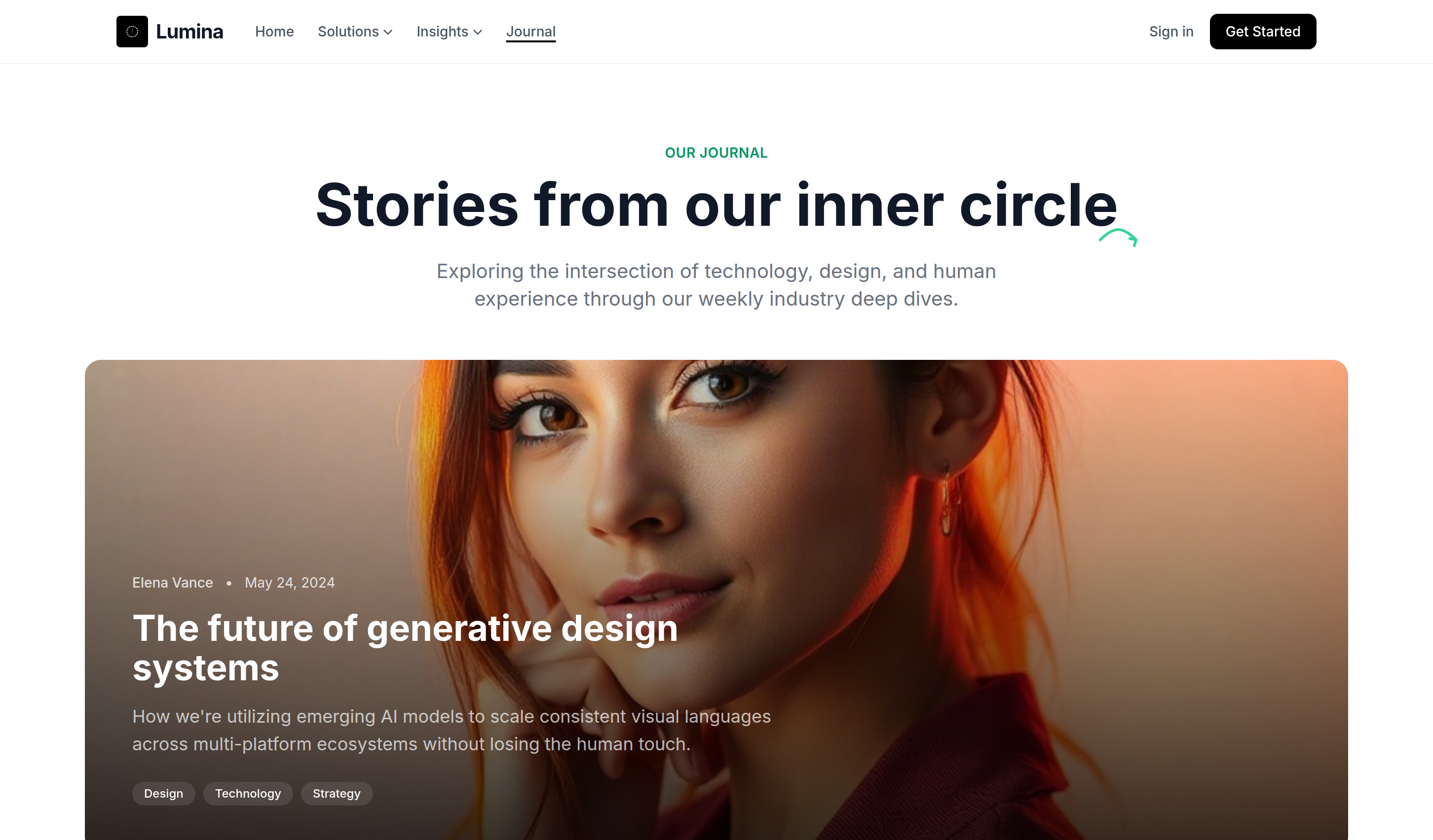
<!DOCTYPE html>
<html lang="en">
<head>
<script>
window.FontAwesomeConfig = {
autoReplaceSvg: 'nest'
};
</script>
<script src="https://cdnjs.cloudflare.com/ajax/libs/font-awesome/6.4.0/js/all.min.js" crossorigin="anonymous" referrerpolicy="no-referrer"></script>
<meta charset="UTF-8">
<meta name="viewport" content="width=device-width, initial-scale=1.0">
<title>Lumina</title>
<script src="https://cdn.tailwindcss.com"></script>
<link rel="stylesheet" href="https://cdnjs.cloudflare.com/ajax/libs/font-awesome/6.4.0/css/all.min.css">
<link href="https://fonts.googleapis.com/css2?family=Inter:wght@300;400;500;600;700&display=swap" rel="stylesheet">
<style>
body {
font-family: 'Inter', sans-serif;
}
.hand-drawn-stroke {
position: relative;
}
.hand-drawn-stroke::after {
content: "";
position: absolute;
bottom: -8px;
right: -20px;
width: 40px;
height: 20px;
background-image: url("data:image/svg+xml,%3Csvg width='44' height='22' viewBox='0 0 44 22' fill='none' xmlns='http://www.w3.org/2000/svg'%3E%3Cpath d='M2 13.5C2 13.5 12.5 2 22 2C31.5 2 42 13.5 42 13.5' stroke='%2334D399' stroke-width='3' stroke-linecap='round'/%3E%3Cpath d='M35 12L42 13.5L40 20' stroke='%2334D399' stroke-width='3' stroke-linecap='round' stroke-linejoin='round'/%3E%3C/svg%3E");
background-repeat: no-repeat;
background-size: contain;
}
</style>
</head>
<body class="bg-white text-gray-900 overflow-x-hidden">
<!-- block:start navbar -->
<nav id="header" class="sticky top-0 z-50 bg-white/80 backdrop-blur-md border-b border-gray-100">
<div class="max-w-7xl mx-auto px-4 sm:px-6 lg:px-8">
<div class="flex justify-between h-16 items-center">
<div class="flex items-center gap-8">
<a href="#" class="flex items-center gap-2">
<div class="w-8 h-8 bg-black rounded flex items-center justify-center">
<i class="fa-solid fa-sparkles text-white text-xs"></i>
</div>
<span class="text-xl font-bold tracking-tight">Lumina</span>
</a>
<div class="hidden md:flex items-center gap-6 text-sm font-medium text-gray-600">
<a href="#" class="hover:text-black transition-colors">Home</a>
<div class="relative group">
<button class="flex items-center gap-1 hover:text-black transition-colors focus:outline-none">
Solutions <i class="fa-solid fa-chevron-down text-[10px]"></i>
</button>
</div>
<div class="relative group">
<button class="flex items-center gap-1 hover:text-black transition-colors focus:outline-none">
Insights <i class="fa-solid fa-chevron-down text-[10px]"></i>
</button>
</div>
<a href="#" class="hover:text-black transition-colors underline decoration-black underline-offset-4 decoration-2">Journal</a>
</div>
</div>
<div class="flex items-center gap-4">
<button class="hidden sm:block text-sm font-medium text-gray-600 hover:text-black transition-colors">Sign in</button>
<button class="bg-black text-white px-4 py-2 rounded-lg text-sm font-medium hover:bg-gray-800 transition-all">Get Started</button>
<button class="md:hidden text-gray-600">
<i class="fa-solid fa-bars text-xl"></i>
</button>
</div>
</div>
</div>
</nav>
<!-- block:end navbar -->
<!-- block:start hero -->
<header id="hero" class="pt-20 pb-12 px-4 sm:px-6 lg:px-8">
<div class="max-w-4xl mx-auto text-center">
<p class="text-emerald-600 font-semibold text-sm tracking-wide uppercase mb-3">Our Journal</p>
<h1 class="text-4xl md:text-5xl lg:text-6xl font-bold text-gray-900 mb-6 leading-tight">
Stories from our <span class="hand-drawn-stroke">inner circle</span>
</h1>
<p class="text-lg md:text-xl text-gray-500 max-w-2xl mx-auto leading-relaxed">
Exploring the intersection of technology, design, and human experience through our weekly industry deep dives.
</p>
</div>
</header>
<!-- block:end hero -->
<!-- block:start featured-post -->
<section id="featured" class="px-4 sm:px-6 lg:px-8 mb-16">
<div class="max-w-7xl mx-auto">
<div class="relative group overflow-hidden rounded-2xl cursor-pointer">
<div class="h-[500px] w-full">
<img class="w-full h-full object-cover transition-transform duration-700 group-hover:scale-105" src="https://storage.googleapis.com/uxpilot-auth.appspot.com/gen_e9356f2723_9f12411a8b8bba28.png" alt="dramatic portrait of a creative professional in a minimal studio, soft warm side lighting, high-end " />
</div>
<div class="absolute inset-0 bg-gradient-to-t from-black/80 via-black/40 to-transparent flex flex-col justify-end p-8 sm:p-12">
<div class="max-w-2xl">
<div class="flex items-center gap-3 text-white/80 text-sm mb-4">
<span class="font-medium">Elena Vance</span>
<span>•</span>
<span>May 24, 2024</span>
</div>
<h2 class="text-3xl sm:text-4xl font-bold text-white mb-4 group-hover:text-emerald-400 transition-colors">The future of generative design systems</h2>
<p class="text-white/70 text-lg mb-6 line-clamp-2">How we're utilizing emerging AI models to scale consistent visual languages across multi-platform ecosystems without losing the human touch.</p>
<div class="flex flex-wrap gap-2">
<span class="px-3 py-1 rounded-full bg-white/10 text-white text-xs font-medium backdrop-blur-md">Design</span>
<span class="px-3 py-1 rounded-full bg-white/10 text-white text-xs font-medium backdrop-blur-md">Technology</span>
<span class="px-3 py-1 rounded-full bg-white/10 text-white text-xs font-medium backdrop-blur-md">Strategy</span>
</div>
</div>
</div>
</div>
</div>
</section>
<!-- block:end featured-post -->
<!-- block:start blog-grid -->
<section id="posts" class="px-4 sm:px-6 lg:px-8 mb-20">
<div class="max-w-7xl mx-auto">
<div class="grid grid-cols-1 md:grid-cols-2 lg:grid-cols-3 gap-x-8 gap-y-12">
<!-- Post Item 1 -->
<article class="group">
<div class="relative overflow-hidden rounded-xl mb-6 h-60">
<img class="w-full h-full object-cover transition-transform duration-500 group-hover:scale-110" src="https://storage.googleapis.com/uxpilot-auth.appspot.com/gen_0ed9db5db0_629c4fb9c48f4fe2.png" alt="modern tech minimalist desk setup with laptop and plants, bright natural lighting" />
</div>
<div class="space-y-3">
<div class="flex items-center gap-2 text-emerald-600 text-sm font-semibold">
<span>Marcus Aurel</span>
<span>•</span>
<span>12 May 2024</span>
</div>
<div class="flex justify-between items-start gap-4">
<h3 class="text-xl font-bold group-hover:text-emerald-600 transition-colors leading-tight">Mastering Design-Led Growth</h3>
<i class="fa-solid fa-arrow-up-right text-gray-400 group-hover:text-emerald-600 transition-all transform group-hover:translate-x-1 group-hover:-translate-y-1"></i>
</div>
<p class="text-gray-600 line-clamp-3">Understanding how putting design at the core of your product strategy can drive sustainable business expansion and loyalty.</p>
<div class="flex flex-wrap gap-2 pt-2">
<span class="px-3 py-1 rounded-full bg-gray-100 text-gray-600 text-xs font-medium">Growth</span>
<span class="px-3 py-1 rounded-full bg-gray-100 text-gray-600 text-xs font-medium">SaaS</span>
</div>
</div>
</article>
<!-- Post Item 2 -->
<article class="group">
<div class="relative overflow-hidden rounded-xl mb-6 h-60">
<img class="w-full h-full object-cover transition-transform duration-500 group-hover:scale-110" src="https://storage.googleapis.com/uxpilot-auth.appspot.com/gen_81ce028882_ad305ab52261ed2a.png" alt="abstract digital art showing interconnected data nodes, glowing neon lines on dark background" />
</div>
<div class="space-y-3">
<div class="flex items-center gap-2 text-emerald-600 text-sm font-semibold">
<span>Sarah Jenkins</span>
<span>•</span>
<span>08 May 2024</span>
</div>
<div class="flex justify-between items-start gap-4">
<h3 class="text-xl font-bold group-hover:text-emerald-600 transition-colors leading-tight">Securing the Data Architecture</h3>
<i class="fa-solid fa-arrow-up-right text-gray-400 group-hover:text-emerald-600 transition-all transform group-hover:translate-x-1 group-hover:-translate-y-1"></i>
</div>
<p class="text-gray-600 line-clamp-3">A deep dive into the latest encryption standards and why decentralized storage is becoming the new industry benchmark.</p>
<div class="flex flex-wrap gap-2 pt-2">
<span class="px-3 py-1 rounded-full bg-gray-100 text-gray-600 text-xs font-medium">Engineering</span>
<span class="px-3 py-1 rounded-full bg-gray-100 text-gray-600 text-xs font-medium">Security</span>
</div>
</div>
</article>
<!-- Post Item 3 -->
<article class="group">
<div class="relative overflow-hidden rounded-xl mb-6 h-60">
<img class="w-full h-full object-cover transition-transform duration-500 group-hover:scale-110" src="https://storage.googleapis.com/uxpilot-auth.appspot.com/gen_8e2e813bd3_a6fc9251368318f5.png" alt="two people discussing over a large tablet in a bright office space, collaboration vibes" />
</div>
<div class="space-y-3">
<div class="flex items-center gap-2 text-emerald-600 text-sm font-semibold">
<span>David Chen</span>
<span>•</span>
<span>05 May 2024</span>
</div>
<div class="flex justify-between items-start gap-4">
<h3 class="text-xl font-bold group-hover:text-emerald-600 transition-colors leading-tight">The Art of Silent Collaboration</h3>
<i class="fa-solid fa-arrow-up-right text-gray-400 group-hover:text-emerald-600 transition-all transform group-hover:translate-x-1 group-hover:-translate-y-1"></i>
</div>
<p class="text-gray-600 line-clamp-3">Why deep work and asynchronous communication are the keys to high-performing remote teams in 2024.</p>
<div class="flex flex-wrap gap-2 pt-2">
<span class="px-3 py-1 rounded-full bg-gray-100 text-gray-600 text-xs font-medium">Culture</span>
<span class="px-3 py-1 rounded-full bg-gray-100 text-gray-600 text-xs font-medium">Management</span>
</div>
</div>
</article>
<!-- Post Item 4 -->
<article class="group">
<div class="relative overflow-hidden rounded-xl mb-6 h-60">
<img class="w-full h-full object-cover transition-transform duration-500 group-hover:scale-110" src="https://storage.googleapis.com/uxpilot-auth.appspot.com/gen_330e78b9b4_299602393b85cdbf.png" alt="minimalist office interior with wooden desk and stylish lamp, architectural photography" />
</div>
<div class="space-y-3">
<div class="flex items-center gap-2 text-emerald-600 text-sm font-semibold">
<span>Lila Thorne</span>
<span>•</span>
<span>01 May 2024</span>
</div>
<div class="flex justify-between items-start gap-4">
<h3 class="text-xl font-bold group-hover:text-emerald-600 transition-colors leading-tight">Minimalism in UX Psychology</h3>
<i class="fa-solid fa-arrow-up-right text-gray-400 group-hover:text-emerald-600 transition-all transform group-hover:translate-x-1 group-hover:-translate-y-1"></i>
</div>
<p class="text-gray-600 line-clamp-3">Exploring the cognitive load benefits of reduced UI complexity and how to balance aesthetics with functionality.</p>
<div class="flex flex-wrap gap-2 pt-2">
<span class="px-3 py-1 rounded-full bg-gray-100 text-gray-600 text-xs font-medium">UX Research</span>
<span class="px-3 py-1 rounded-full bg-gray-100 text-gray-600 text-xs font-medium">Design</span>
</div>
</div>
</article>
<!-- Post Item 5 -->
<article class="group">
<div class="relative overflow-hidden rounded-xl mb-6 h-60">
<img class="w-full h-full object-cover transition-transform duration-500 group-hover:scale-110" src="https://storage.googleapis.com/uxpilot-auth.appspot.com/gen_b1c24ef66c_b4b72d691d2cc2b3.png" alt="professional computer monitor showing high-fidelity wireframes and design tools" />
</div>
<div class="space-y-3">
<div class="flex items-center gap-2 text-emerald-600 text-sm font-semibold">
<span>Julian Cross</span>
<span>•</span>
<span>28 Apr 2024</span>
</div>
<div class="flex justify-between items-start gap-4">
<h3 class="text-xl font-bold group-hover:text-emerald-600 transition-colors leading-tight">Prototypes That Feel Real</h3>
<i class="fa-solid fa-arrow-up-right text-gray-400 group-hover:text-emerald-600 transition-all transform group-hover:translate-x-1 group-hover:-translate-y-1"></i>
</div>
<p class="text-gray-600 line-clamp-3">Bridging the gap between static design and production code with high-fidelity interactive prototypes.</p>
<div class="flex flex-wrap gap-2 pt-2">
<span class="px-3 py-1 rounded-full bg-gray-100 text-gray-600 text-xs font-medium">Tooling</span>
<span class="px-3 py-1 rounded-full bg-gray-100 text-gray-600 text-xs font-medium">Product</span>
</div>
</div>
</article>
<!-- Post Item 6 -->
<article class="group">
<div class="relative overflow-hidden rounded-xl mb-6 h-60">
<img class="w-full h-full object-cover transition-transform duration-500 group-hover:scale-110" src="https://storage.googleapis.com/uxpilot-auth.appspot.com/gen_d440b8fedf_84a776e869aa13df.png" alt="team of diverse designers working together in a whiteboard session" />
</div>
<div class="space-y-3">
<div class="flex items-center gap-2 text-emerald-600 text-sm font-semibold">
<span>Mina Sato</span>
<span>•</span>
<span>25 Apr 2024</span>
</div>
<div class="flex justify-between items-start gap-4">
<h3 class="text-xl font-bold group-hover:text-emerald-600 transition-colors leading-tight">Scaling Design Teams</h3>
<i class="fa-solid fa-arrow-up-right text-gray-400 group-hover:text-emerald-600 transition-all transform group-hover:translate-x-1 group-hover:-translate-y-1"></i>
</div>
<p class="text-gray-600 line-clamp-3">Lessons learned from growing our internal creative department from 5 to 50 people across three timezones.</p>
<div class="flex flex-wrap gap-2 pt-2">
<span class="px-3 py-1 rounded-full bg-gray-100 text-gray-600 text-xs font-medium">Leadership</span>
<span class="px-3 py-1 rounded-full bg-gray-100 text-gray-600 text-xs font-medium">Culture</span>
</div>
</div>
</article>
</div>
<!-- block:start pagination -->
<div class="mt-16 pt-8 border-t border-gray-100 flex flex-col sm:flex-row items-center justify-between gap-6">
<button class="flex items-center gap-2 text-sm font-medium text-gray-600 hover:text-black transition-colors group">
<i class="fa-solid fa-arrow-left transition-transform group-hover:-translate-x-1"></i>
Previous
</button>
<div class="flex items-center gap-2">
<button class="w-10 h-10 rounded-lg bg-black text-white text-sm font-medium">1</button>
<button class="w-10 h-10 rounded-lg hover:bg-gray-100 text-gray-600 text-sm font-medium transition-colors">2</button>
<button class="w-10 h-10 rounded-lg hover:bg-gray-100 text-gray-600 text-sm font-medium transition-colors">3</button>
<span class="px-2 text-gray-400">...</span>
<button class="w-10 h-10 rounded-lg hover:bg-gray-100 text-gray-600 text-sm font-medium transition-colors">8</button>
<button class="w-10 h-10 rounded-lg hover:bg-gray-100 text-gray-600 text-sm font-medium transition-colors">9</button>
<button class="w-10 h-10 rounded-lg hover:bg-gray-100 text-gray-600 text-sm font-medium transition-colors">10</button>
</div>
<button class="flex items-center gap-2 text-sm font-medium text-gray-600 hover:text-black transition-colors group">
Next
<i class="fa-solid fa-arrow-right transition-transform group-hover:translate-x-1"></i>
</button>
</div>
<!-- block:end pagination -->
</div>
</section>
<!-- block:end blog-grid -->
<!-- block:start cta -->
<section id="cta" class="px-4 sm:px-6 lg:px-8 mb-12">
<div class="max-w-7xl mx-auto rounded-3xl overflow-hidden relative">
<div class="absolute inset-0 bg-gradient-to-br from-indigo-600 via-purple-600 to-emerald-500 opacity-90"></div>
<div class="relative px-8 py-20 sm:py-24 text-center">
<h2 class="text-3xl sm:text-4xl lg:text-5xl font-bold text-white mb-6">Build the future of digital experiences</h2>
<p class="text-white/80 text-lg mb-10 max-w-2xl mx-auto">Join over 10,000+ creators and engineers already using Lumina to power their next big idea.</p>
<div class="flex flex-col sm:flex-row items-center justify-center gap-4">
<button class="w-full sm:w-auto px-8 py-4 bg-white text-black font-semibold rounded-xl hover:bg-gray-100 transition-all transform hover:scale-105">Start 14-day free trial</button>
<button class="w-full sm:w-auto px-8 py-4 bg-white/10 text-white font-semibold rounded-xl border border-white/20 hover:bg-white/20 transition-all backdrop-blur-sm">Schedule a demo</button>
</div>
</div>
</div>
</section>
<!-- block:end cta -->
<!-- block:start footer -->
<footer id="footer" class="bg-white pt-20 pb-12 px-4 sm:px-6 lg:px-8 border-t border-gray-100">
<div class="max-w-7xl mx-auto">
<div class="grid grid-cols-2 md:grid-cols-3 lg:grid-cols-6 gap-12 mb-16">
<div>
<h4 class="text-sm font-semibold text-gray-400 uppercase tracking-wider mb-6">Product</h4>
<ul class="space-y-4 text-gray-600">
<li><a href="#" class="hover:text-black transition-colors">Overview</a></li>
<li><a href="#" class="hover:text-black transition-colors">Features</a></li>
<li><a href="#" class="hover:text-black transition-colors">Solutions</a></li>
<li><a href="#" class="hover:text-black transition-colors">Tutorials</a></li>
<li><a href="#" class="hover:text-black transition-colors">Pricing</a></li>
</ul>
</div>
<div>
<h4 class="text-sm font-semibold text-gray-400 uppercase tracking-wider mb-6">Company</h4>
<ul class="space-y-4 text-gray-600">
<li><a href="#" class="hover:text-black transition-colors">About us</a></li>
<li><a href="#" class="hover:text-black transition-colors">Careers</a></li>
<li><a href="#" class="hover:text-black transition-colors">Press</a></li>
<li><a href="#" class="hover:text-black transition-colors">News</a></li>
<li><a href="#" class="hover:text-black transition-colors">Contact</a></li>
</ul>
</div>
<div>
<h4 class="text-sm font-semibold text-gray-400 uppercase tracking-wider mb-6">Resources</h4>
<ul class="space-y-4 text-gray-600">
<li><a href="#" class="hover:text-black transition-colors">Blog</a></li>
<li><a href="#" class="hover:text-black transition-colors">Newsletter</a></li>
<li><a href="#" class="hover:text-black transition-colors">Events</a></li>
<li><a href="#" class="hover:text-black transition-colors">Help centre</a></li>
<li><a href="#" class="hover:text-black transition-colors">Support</a></li>
</ul>
</div>
<div>
<h4 class="text-sm font-semibold text-gray-400 uppercase tracking-wider mb-6">Use Cases</h4>
<ul class="space-y-4 text-gray-600">
<li><a href="#" class="hover:text-black transition-colors">Startups</a></li>
<li><a href="#" class="hover:text-black transition-colors">Enterprise</a></li>
<li><a href="#" class="hover:text-black transition-colors">Government</a></li>
<li><a href="#" class="hover:text-black transition-colors">SaaS</a></li>
<li><a href="#" class="hover:text-black transition-colors">Marketplaces</a></li>
</ul>
</div>
<div>
<h4 class="text-sm font-semibold text-gray-400 uppercase tracking-wider mb-6">Social</h4>
<ul class="space-y-4 text-gray-600">
<li><a href="#" class="hover:text-black transition-colors">Twitter</a></li>
<li><a href="#" class="hover:text-black transition-colors">LinkedIn</a></li>
<li><a href="#" class="hover:text-black transition-colors">Facebook</a></li>
<li><a href="#" class="hover:text-black transition-colors">GitHub</a></li>
<li><a href="#" class="hover:text-black transition-colors">Dribbble</a></li>
</ul>
</div>
<div>
<h4 class="text-sm font-semibold text-gray-400 uppercase tracking-wider mb-6">Legal</h4>
<ul class="space-y-4 text-gray-600">
<li><a href="#" class="hover:text-black transition-colors">Terms</a></li>
<li><a href="#" class="hover:text-black transition-colors">Privacy</a></li>
<li><a href="#" class="hover:text-black transition-colors">Cookies</a></li>
<li><a href="#" class="hover:text-black transition-colors">Licenses</a></li>
<li><a href="#" class="hover:text-black transition-colors">Settings</a></li>
</ul>
</div>
</div>
<div class="pt-8 border-t border-gray-100 flex flex-col md:flex-row justify-between items-center gap-6">
<a href="#" class="flex items-center gap-2">
<div class="w-6 h-6 bg-black rounded flex items-center justify-center">
<i class="fa-solid fa-sparkles text-white text-[10px]"></i>
</div>
<span class="text-lg font-bold tracking-tight">Lumina</span>
</a>
<p class="text-sm text-gray-500">© 2024 Lumina Systems. All rights reserved.</p>
<div class="flex items-center gap-4 text-gray-400">
<a href="#" class="hover:text-black transition-colors"><i class="fa-brands fa-twitter"></i></a>
<a href="#" class="hover:text-black transition-colors"><i class="fa-brands fa-linkedin"></i></a>
<a href="#" class="hover:text-black transition-colors"><i class="fa-brands fa-github"></i></a>
</div>
</div>
</div>
</footer>
<!-- block:end footer -->
</body>
</html>
Unlimited access to all templates
Unlock our entire library of premium UI kits, dashboards, and landing pages. Renews automatically, cancel anytime.
€20
/ 3 months
or €60 / year
Get Unlimited Access