Free
0
22
Oblique
Oblique is a minimal fashion ecommerce template for independent clothing labels, capsule wardrobes, and slow-fashion boutiques that sell online.
Download Codebase
Commercial License<%# letstemplates: access=free category=ecommerce %>
<!DOCTYPE html>
<html lang="en">
<head>
<script>
window.FontAwesomeConfig = { autoReplaceSvg: 'nest' };
</script>
<script src="https://cdnjs.cloudflare.com/ajax/libs/font-awesome/6.4.0/js/all.min.js" crossorigin="anonymous" referrerpolicy="no-referrer"></script>
<meta charset="UTF-8">
<meta name="viewport" content="width=device-width, initial-scale=1.0">
<title>Oblique | Tailwind CSS Fashion Ecommerce Template</title>
<meta name="description" content="Oblique is a minimal Tailwind CSS fashion ecommerce template for independent clothing labels, capsule wardrobes, and slow-fashion boutiques that sell online.">
<meta name="keywords" content="Oblique, Tailwind CSS template, HTML website template, fashion ecommerce, clothing store template, minimal online boutique, capsule wardrobe shop, responsive store design">
<meta name="author" content="Let's templates">
<link rel="canonical" href="">
<meta property="og:type" content="product">
<meta property="og:site_name" content="Let's templates">
<meta property="og:locale" content="en_US">
<meta property="og:url" content="">
<meta property="og:title" content="Oblique | Tailwind CSS Fashion Ecommerce Template">
<meta property="og:description" content="A minimal Tailwind CSS fashion ecommerce template for independent clothing labels, capsule wardrobes, and slow-fashion boutiques that sell online.">
<meta property="og:image" content="">
<meta property="og:image:alt" content="Oblique template preview">
<meta name="twitter:card" content="summary_large_image">
<meta name="twitter:url" content="">
<meta name="twitter:title" content="Oblique | Tailwind CSS Fashion Ecommerce Template">
<meta name="twitter:description" content="A minimal Tailwind CSS fashion ecommerce template for independent clothing labels, capsule wardrobes, and slow-fashion boutiques that sell online.">
<meta name="twitter:image" content="">
<meta name="twitter:image:alt" content="Oblique template preview">
<script src="https://cdn.tailwindcss.com"></script>
<link rel="stylesheet" href="https://cdnjs.cloudflare.com/ajax/libs/font-awesome/6.4.0/css/all.min.css">
<link rel="preconnect" href="https://fonts.googleapis.com">
<link rel="preconnect" href="https://fonts.gstatic.com" crossorigin>
<link href="https://fonts.googleapis.com/css2?family=Courier+Prime:wght@700&family=Inter:wght@400;500;600&family=Inter+Tight:wght@400;500;600&display=swap" rel="stylesheet">
<script>
tailwind.config = {
theme: {
extend: {
colors: {
paper: '#faf9f6',
ink: '#141414',
stone: '#6d6b66',
line: '#e5e2db',
sand: '#efece6'
},
fontFamily: {
sans: ['Inter', 'Helvetica Neue', 'Arial', 'sans-serif'],
display: ['"Inter Tight"', 'Helvetica Neue', 'Arial', 'sans-serif'],
mono: ['"Courier Prime"', 'Courier New', 'monospace']
}
}
}
};
</script>
<style>
@view-transition {
navigation: auto;
}
::view-transition-old(root) {
animation: 180ms ease-out both page-fade-out;
}
::view-transition-new(root) {
animation: 220ms ease-in both page-fade-in;
}
@keyframes page-fade-out {
to { opacity: 0; }
}
@keyframes page-fade-in {
from { opacity: 0; }
}
@media (prefers-reduced-motion: reduce) {
::view-transition-old(root),
::view-transition-new(root) {
animation: none;
}
}
.reveal-ready [data-reveal] { opacity: 0; transform: translateY(24px); transition: opacity .6s ease, transform .6s ease; transition-delay: var(--reveal-delay, 0ms); }
.reveal-ready [data-reveal].is-visible { opacity: 1; transform: none; }
</style>
</head>
<body class="overflow-x-hidden bg-paper font-sans text-ink antialiased">
<!-- block:start navbar -->
<header id="top" class="relative z-30 bg-paper">
<nav class="mx-auto flex max-w-[1600px] items-center justify-between gap-6 px-5 py-5 sm:px-8 lg:px-10 lg:py-6" aria-label="Main">
<a href="index.html" aria-current="page" class="font-mono text-[26px] font-bold leading-none tracking-tight lg:text-[28px]">oblique.</a>
<div class="hidden items-center gap-9 text-[15px] md:flex">
<a href="about-us.html" class="text-ink/80 transition-colors hover:text-ink">About Us</a>
<a href="catalog.html" class="text-ink/80 transition-colors hover:text-ink">Catalog</a>
<a href="new-collection.html" class="text-ink/80 transition-colors hover:text-ink">New Collection</a>
<a href="best-sellers.html" class="text-ink/80 transition-colors hover:text-ink">Best Sellers</a>
</div>
<div class="flex items-center gap-5 sm:gap-7">
<a href="cart.html" class="text-[15px] text-ink/80 transition-colors hover:text-ink">Bag (<span data-cart-count>2</span>)</a>
<a href="catalog.html" class="hidden h-12 items-center justify-center bg-ink px-12 text-[15px] text-white transition-colors hover:bg-black/80 sm:inline-flex">View catalog</a>
<button type="button" data-menu-toggle aria-controls="mobile-menu" aria-expanded="false" aria-label="Open menu" class="-mr-2 flex h-10 w-10 items-center justify-center md:hidden">
<i class="fa-solid fa-bars text-lg"></i>
</button>
</div>
</nav>
<div id="mobile-menu" class="hidden border-t border-line px-5 pb-6 pt-2 sm:px-8 md:hidden">
<a href="about-us.html" class="block border-b border-line py-4 text-lg">About Us</a>
<a href="catalog.html" class="block border-b border-line py-4 text-lg">Catalog</a>
<a href="new-collection.html" class="block border-b border-line py-4 text-lg">New Collection</a>
<a href="best-sellers.html" class="block border-b border-line py-4 text-lg">Best Sellers</a>
<a href="contact.html" class="block border-b border-line py-4 text-lg">Contact</a>
<a href="catalog.html" class="mt-6 flex h-12 items-center justify-center bg-ink text-[15px] text-white">View catalog</a>
</div>
</header>
<!-- block:end navbar -->
<main>
<!-- block:start hero -->
<section id="hero" class="mx-auto max-w-[1600px] px-5 pb-16 pt-2 sm:px-8 lg:px-10 lg:pb-24">
<div class="grid gap-8 md:grid-cols-2 md:gap-10">
<figure class="aspect-[4/5] overflow-hidden bg-sand md:aspect-auto md:h-[640px] lg:h-[780px]">
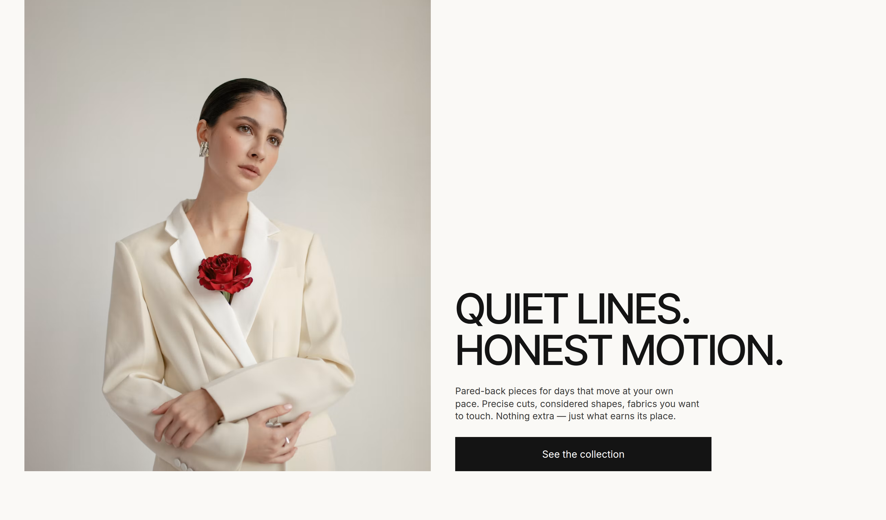
<img src="https://images.unsplash.com/photo-1571513722275-4b41940f54b8?auto=format&fit=crop&w=1200&q=80" alt="Model in a cream tailored suit standing against a pale studio wall" class="h-full w-full object-cover object-top">
</figure>
<div class="flex flex-col justify-end" data-reveal>
<h1 class="font-display text-[42px] font-medium uppercase leading-[0.98] tracking-[-0.02em] sm:text-6xl lg:text-[64px] xl:text-[68px]">Quiet lines.<br>Honest motion.</h1>
<p class="mt-6 max-w-[400px] text-[15px] leading-[1.35] text-ink/85">Pared-back pieces for days that move at your own pace. Precise cuts, considered shapes, fabrics you want to touch. Nothing extra — just what earns its place.</p>
<a href="new-collection.html" class="mt-6 inline-flex h-14 w-full max-w-[420px] items-center justify-center bg-ink text-base text-white transition-colors hover:bg-black/80">See the collection</a>
</div>
</div>
</section>
<!-- block:end hero -->
<!-- block:start features -->
<section id="bestsellers" class="mx-auto max-w-[1600px] px-5 py-16 sm:px-8 lg:px-10 lg:py-20">
<div class="grid gap-10 lg:grid-cols-4">
<div class="flex flex-col justify-between gap-10 lg:col-span-2">
<h2 class="font-display text-4xl font-medium uppercase leading-[1.05] tracking-[-0.015em] md:text-5xl" data-reveal>Reached for<br>every day</h2>
<div class="grid gap-10 sm:grid-cols-2">
<div class="hidden sm:block"></div>
<div class="flex flex-col" data-reveal style="--reveal-delay: 120ms">
<p class="text-[15px] leading-[1.35] text-ink/85">The pieces our customers wear until they soften. Simple to pair, never dated, and at ease from the very first day.</p>
<figure class="mt-5 aspect-[7/8] overflow-hidden bg-sand">
<img src="https://images.unsplash.com/photo-1601762603339-fd61e28b698a?auto=format&fit=crop&w=800&q=80" alt="Model shielding her face with the sleeve of an oversized grey poplin shirt" class="h-full w-full object-cover">
</figure>
<a href="best-sellers.html" class="mt-5 inline-flex h-14 items-center justify-center bg-ink text-base text-white transition-colors hover:bg-black/80">Shop best sellers</a>
</div>
</div>
</div>
<figure class="aspect-[8/9] overflow-hidden bg-sand lg:col-span-2" data-reveal style="--reveal-delay: 200ms">
<img src="https://images.unsplash.com/photo-1581403341630-a6e0b9d2d257?auto=format&fit=crop&w=1400&q=80" alt="Model in a fitted black merino turtleneck photographed in soft side light" class="h-full w-full object-cover">
</figure>
</div>
</section>
<!-- block:end features -->
<!-- block:start cta -->
<section id="new-collection" class="mx-auto max-w-[1600px] px-5 py-16 sm:px-8 lg:px-10 lg:py-20">
<div class="relative isolate flex min-h-[560px] flex-col justify-between overflow-hidden bg-[#8e9a97] p-6 text-white sm:p-10 md:min-h-[640px] lg:min-h-[760px] lg:p-16">
<img src="https://images.unsplash.com/photo-1612215327100-60fc5c4d7938?auto=format&fit=crop&w=1800&h=1050&crop=focalpoint&fp-y=0.35&q=80" alt="Two models in matching pale sage suits posing against a ribbed grey wall" class="absolute inset-0 -z-10 h-full w-full object-cover object-[50%_30%]">
<div class="absolute inset-0 -z-10 bg-gradient-to-b from-black/30 via-transparent to-black/40"></div>
<h2 class="max-w-xl font-display text-[30px] font-medium uppercase leading-[1.05] tracking-[-0.015em] sm:text-4xl md:text-5xl" data-reveal>The new season —<br>a quieter mood</h2>
<div class="max-w-[340px]" data-reveal style="--reveal-delay: 120ms">
<p class="text-[15px] leading-[1.35] text-white/90">We started with proportion and negative space. Fewer details, cleaner edges, more air around the body. The result sits between tailored and relaxed — made for the street and the calm hours after it.</p>
<a href="new-collection.html" class="mt-6 inline-flex h-14 w-full max-w-[310px] items-center justify-center bg-white text-base text-ink transition-colors hover:bg-paper">Discover new arrivals</a>
</div>
</div>
</section>
<!-- block:end cta -->
<!-- block:start products -->
<section id="shop" class="mx-auto max-w-[1600px] px-5 py-16 sm:px-8 lg:px-10 lg:py-24">
<%
products = [
["Column Wool Blazer", 240, "outerwear", "Stone check", "photo-1608234808654-2a8875faa7fd", "Woman in a grey checked wool blazer over a white shirt", "column-wool-blazer.html"],
["Draped Camel Coat", 320, "outerwear", "Camel", "photo-1619603364904-c0498317e145", "Model in a long camel coat over a brown turtleneck", "draped-camel-coat.html"],
["Olive Strap Playsuit", 185, "dresses", "Olive", "photo-1618932260643-eee4a2f652a6", "Olive belted strappy playsuit on a hanger", "olive-strap-playsuit.html"],
["Open-Knit Cape", 135, "knitwear", "Ecru", "photo-1434389677669-e08b4cac3105", "Cream open-knit fringed cape on a wooden hanger", "column-wool-blazer.html"],
["Rust Cropped Bomber", 210, "outerwear", "Rust", "photo-1591047139829-d91aecb6caea", "Rust satin bomber jacket held up on a hanger", "draped-camel-coat.html"],
["Loop-Back Sweatshirt", 95, "tops", "Chalk", "photo-1620799140408-edc6dcb6d633", "White loop-back sweatshirt laid flat on a table", "column-wool-blazer.html"],
["Belted Midi Dress", 210, "dresses", "Black", "photo-1550639525-c97d455acf70", "Woman in a black knit top and belted quilted midi skirt", "olive-strap-playsuit.html"],
["Washed Cotton Tee", 48, "tops", "Sky", "photo-1564584217132-2271feaeb3c5", "Pale blue washed cotton tee on a hanger", "column-wool-blazer.html"]
]
%>
<div class="flex flex-col gap-8 md:flex-row md:items-end md:justify-between">
<div data-reveal>
<p class="text-[13px] uppercase tracking-[0.18em] text-stone">Shop the edit</p>
<h2 class="mt-3 font-display text-4xl font-medium uppercase leading-[1.05] tracking-[-0.015em] md:text-5xl">Pieces for now</h2>
</div>
<div role="group" aria-label="Filter products" data-filter-group class="-mx-5 flex gap-2 overflow-x-auto px-5 pb-1 text-sm sm:mx-0 sm:flex-wrap sm:px-0">
<% [["all", "All"], ["outerwear", "Outerwear"], ["knitwear", "Knitwear"], ["tops", "Tops"], ["dresses", "Dresses"]].each do |value, label| %>
<button type="button" data-filter="<%= value %>" aria-pressed="<%= value == "all" %>" class="<%= value == "all" ? "bg-ink text-white" : "" %> shrink-0 border border-ink px-5 py-2.5 transition-colors hover:bg-ink hover:text-white"><%= label %></button>
<% end %>
</div>
</div>
<div data-filter-items class="mt-10 grid grid-cols-2 gap-x-4 gap-y-10 md:gap-x-6 lg:grid-cols-4 lg:gap-x-10">
<% products.each_with_index do |(name, price, category, color, photo, alt, href), index| %>
<article data-category="<%= category %>" class="group" data-reveal style="--reveal-delay: <%= (index % 4) * 100 %>ms">
<a href="<%= href %>" class="block aspect-[4/5] overflow-hidden bg-sand">
<img src="https://images.unsplash.com/<%= photo %>?auto=format&fit=crop&w=800&q=80" alt="<%= alt %>" loading="lazy" class="h-full w-full object-cover transition-transform duration-700 group-hover:scale-[1.03]">
</a>
<div class="mt-4 flex items-start justify-between gap-3">
<div>
<h3 class="text-[15px] font-medium"><a href="<%= href %>" class="hover:underline"><%= name %></a></h3>
<p class="mt-1 text-sm text-stone"><%= color %></p>
</div>
<p class="text-[15px]">$<%= price %></p>
</div>
<button type="button" data-add-to-cart data-product="<%= name %>" class="mt-4 flex h-11 w-full items-center justify-center border border-ink text-sm transition-colors hover:bg-ink hover:text-white">Add to bag</button>
</article>
<% end %>
</div>
<div class="mt-14 flex justify-center">
<a href="catalog.html" class="inline-flex h-14 w-full max-w-[420px] items-center justify-center bg-ink text-base text-white transition-colors hover:bg-black/80">View the full catalog</a>
</div>
</section>
<!-- block:end products -->
<!-- block:start about -->
<section id="studio" class="border-y border-line bg-sand/60">
<div class="mx-auto grid max-w-[1600px] gap-10 px-5 py-16 sm:px-8 md:grid-cols-2 lg:gap-10 lg:px-10 lg:py-24">
<div class="flex flex-col justify-between gap-12" data-reveal>
<div>
<p class="text-[13px] uppercase tracking-[0.18em] text-stone">The studio</p>
<h2 class="mt-3 max-w-xl font-display text-4xl font-medium uppercase leading-[1.05] tracking-[-0.015em] md:text-5xl">Cut in small runs. Kept for years.</h2>
<p class="mt-6 max-w-md text-[15px] leading-relaxed text-ink/80">Every Oblique piece begins as a paper pattern on our cutting table and ends in one of a handful of family ateliers we have worked with since day one. We release less, so each garment gets the time it needs.</p>
<a href="about-us.html" class="mt-8 inline-flex items-center gap-3 border-b border-ink pb-1 text-[15px]">Read our story <i class="fa-solid fa-arrow-right text-xs"></i></a>
</div>
<dl class="grid grid-cols-3 gap-6 border-t border-ink/15 pt-8">
<div>
<dt class="text-sm text-stone">Partner ateliers</dt>
<dd class="mt-2 font-display text-3xl font-medium md:text-4xl">12</dd>
</div>
<div>
<dt class="text-sm text-stone">Natural fibres</dt>
<dd class="mt-2 font-display text-3xl font-medium md:text-4xl">86%</dd>
</div>
<div>
<dt class="text-sm text-stone">Drops a year</dt>
<dd class="mt-2 font-display text-3xl font-medium md:text-4xl">4</dd>
</div>
</dl>
</div>
<figure class="aspect-[4/3] overflow-hidden bg-sand md:aspect-[5/6] lg:aspect-[6/5]" data-reveal style="--reveal-delay: 150ms">
<img src="https://images.unsplash.com/photo-1558769132-cb1aea458c5e?auto=format&fit=crop&w=1200&q=80" alt="Neutral knitwear and linen garments hanging on a wooden rail beside dried pampas grass" loading="lazy" class="h-full w-full object-cover">
</figure>
</div>
</section>
<!-- block:end about -->
<!-- block:start reviews -->
<section id="reviews" class="mx-auto max-w-[1600px] px-5 py-16 sm:px-8 lg:px-10 lg:py-24">
<%
reviews = [
["The blazer drapes exactly the way I hoped. It has become the one thing I pack for every trip.", "Mara L.", "Column Wool Blazer", "avatar-2"],
["Soft from the first wash and the cut still holds after a winter of wear. Rare to find that balance.", "Hanna K.", "Fine Merino Turtleneck", "avatar-5"],
["Packaging was plastic-free, the fit notes were spot on, and the coat looks better in person.", "Jonas R.", "Draped Camel Coat", "avatar-3"],
["I own fewer clothes than ever and wear all of them. This label is a big reason why.", "Aiko T.", "Loop-Back Sweatshirt", "avatar-6"],
["Quiet, well made, and easy to style up or down. Exchanging a size took two days.", "Elena V.", "Olive Strap Playsuit", "avatar-8"]
]
%>
<div class="flex items-end justify-between gap-6" data-reveal>
<div>
<p class="text-[13px] uppercase tracking-[0.18em] text-stone">Worn & reviewed</p>
<h2 class="mt-3 font-display text-4xl font-medium uppercase leading-[1.05] tracking-[-0.015em] md:text-5xl">In their words</h2>
</div>
</div>
<div data-carousel class="relative mt-10">
<div class="overflow-hidden">
<div data-carousel-track class="-mx-3 flex transition-transform duration-500">
<% reviews.each do |quote, name, product, avatar| %>
<figure class="w-full shrink-0 px-3 md:w-1/2 lg:w-1/3">
<div class="flex h-full flex-col justify-between border border-line bg-white p-7 lg:p-9">
<blockquote class="font-display text-xl leading-snug lg:text-[22px]">“<%= quote %>”</blockquote>
<figcaption class="mt-10 flex items-center gap-4">
<img src="https://storage.googleapis.com/uxpilot-auth.appspot.com/avatars/<%= avatar %>.jpg" alt="Portrait of <%= name %>" loading="lazy" class="h-11 w-11 object-cover grayscale">
<span class="text-sm leading-tight">
<span class="block font-medium"><%= name %></span>
<span class="block text-stone">Bought the <%= product %></span>
</span>
</figcaption>
</div>
</figure>
<% end %>
</div>
</div>
<div class="mt-8 flex items-center justify-between gap-6">
<div data-carousel-dots class="flex gap-2 text-ink"></div>
<div class="flex gap-2">
<button type="button" data-carousel-prev aria-label="Previous review" class="flex h-12 w-12 items-center justify-center border border-ink transition-colors hover:bg-ink hover:text-white"><i class="fa-solid fa-arrow-left text-sm"></i></button>
<button type="button" data-carousel-next aria-label="Next review" class="flex h-12 w-12 items-center justify-center border border-ink transition-colors hover:bg-ink hover:text-white"><i class="fa-solid fa-arrow-right text-sm"></i></button>
</div>
</div>
</div>
</section>
<!-- block:end reviews -->
<!-- block:start newsletter -->
<section id="newsletter" class="mx-auto max-w-[1600px] px-5 pb-16 sm:px-8 lg:px-10 lg:pb-24">
<div class="grid gap-10 bg-ink px-6 py-12 text-white sm:px-10 md:grid-cols-2 md:items-end lg:px-16 lg:py-16">
<div data-reveal>
<h2 class="font-display text-4xl font-medium uppercase leading-[1.05] tracking-[-0.015em] md:text-5xl">Letters from<br>the studio</h2>
<p class="mt-5 max-w-md text-[15px] leading-relaxed text-white/70">One short note each month: new drops before anyone else, fabric stories, and the occasional private sale. No noise.</p>
</div>
<form data-form-message="Thank you — your first letter is on its way." class="w-full" data-reveal style="--reveal-delay: 120ms">
<label for="newsletter-email" class="text-sm text-white/70">Email address</label>
<div class="mt-3 flex flex-col gap-3 sm:flex-row">
<input id="newsletter-email" type="email" required placeholder="you@example.com" class="h-14 flex-1 border border-white/30 bg-transparent px-5 text-base text-white placeholder:text-white/40 focus:border-white focus:outline-none">
<button type="submit" class="h-14 bg-white px-10 text-base text-ink transition-colors hover:bg-paper">Subscribe</button>
</div>
<p data-form-status aria-live="polite" class="mt-3 min-h-[1.25rem] text-sm text-white/70"></p>
</form>
</div>
</section>
<!-- block:end newsletter -->
</main>
<!-- block:start footer -->
<footer class="border-t border-line">
<div class="mx-auto grid max-w-[1600px] gap-12 px-5 py-14 sm:px-8 md:grid-cols-2 lg:grid-cols-5 lg:px-10 lg:py-16">
<div class="lg:col-span-2">
<a href="index.html" class="font-mono text-[28px] font-bold leading-none tracking-tight">oblique.</a>
<p class="mt-5 max-w-xs text-[15px] leading-relaxed text-stone">Considered clothing, cut in small runs and made to be worn for a long time.</p>
<div class="mt-6 flex gap-5 text-lg">
<a href="https://www.instagram.com/" aria-label="Instagram" class="text-ink/70 transition-colors hover:text-ink"><i class="fa-brands fa-instagram"></i></a>
<a href="https://www.pinterest.com/" aria-label="Pinterest" class="text-ink/70 transition-colors hover:text-ink"><i class="fa-brands fa-pinterest"></i></a>
<a href="https://www.tiktok.com/" aria-label="TikTok" class="text-ink/70 transition-colors hover:text-ink"><i class="fa-brands fa-tiktok"></i></a>
</div>
</div>
<div>
<h3 class="text-[13px] uppercase tracking-[0.18em] text-stone">Shop</h3>
<ul class="mt-5 space-y-3 text-[15px]">
<li><a href="catalog.html" class="hover:underline">Catalog</a></li>
<li><a href="new-collection.html" class="hover:underline">New Collection</a></li>
<li><a href="best-sellers.html" class="hover:underline">Best Sellers</a></li>
<li><a href="cart.html" class="hover:underline">Your bag</a></li>
</ul>
</div>
<div>
<h3 class="text-[13px] uppercase tracking-[0.18em] text-stone">Studio</h3>
<ul class="mt-5 space-y-3 text-[15px]">
<li><a href="about-us.html" class="hover:underline">About Us</a></li>
<li><a href="about-us.html#ateliers" class="hover:underline">Our ateliers</a></li>
<li><a href="contact.html" class="hover:underline">Contact</a></li>
</ul>
</div>
<div>
<h3 class="text-[13px] uppercase tracking-[0.18em] text-stone">Help</h3>
<ul class="mt-5 space-y-3 text-[15px]">
<li><a href="contact.html#faq" class="hover:underline">Shipping & returns</a></li>
<li><a href="contact.html#faq" class="hover:underline">Size guide</a></li>
<li><a href="contact.html" class="hover:underline">Garment care</a></li>
</ul>
</div>
</div>
<div class="mx-auto flex max-w-[1600px] flex-col gap-3 border-t border-line px-5 py-6 text-sm text-stone sm:flex-row sm:items-center sm:justify-between sm:px-8 lg:px-10">
<p>© 2026 Oblique Studio. All rights reserved.</p>
<p>Free shipping over $150 · 30-day returns</p>
</div>
</footer>
<!-- block:end footer -->
<script>
document.querySelectorAll("[data-menu-toggle]").forEach((button) => {
const menu = document.getElementById(button.getAttribute("aria-controls"));
if (!menu) return;
button.addEventListener("click", () => {
const open = button.getAttribute("aria-expanded") === "true";
button.setAttribute("aria-expanded", String(!open));
button.setAttribute("aria-label", open ? "Open menu" : "Close menu");
menu.classList.toggle("hidden", open);
});
});
(() => {
const counters = document.querySelectorAll("[data-cart-count]");
const read = () => {
try { return localStorage.getItem("oblique-bag-count"); } catch (error) { return null; }
};
const write = (value) => {
try { localStorage.setItem("oblique-bag-count", String(value)); } catch (error) {}
};
const stored = Number(read());
let count = read() === null || Number.isNaN(stored) ? Number(counters[0]?.textContent || 0) : stored;
const render = () => counters.forEach((counter) => { counter.textContent = count; });
render();
document.querySelectorAll("[data-add-to-cart]").forEach((button) => {
const label = button.textContent;
button.addEventListener("click", () => {
const qtyInput = button.dataset.qtySource ? document.querySelector(button.dataset.qtySource) : null;
count += qtyInput ? Math.max(1, Number(qtyInput.value) || 1) : 1;
write(count);
render();
button.textContent = "Added to bag";
setTimeout(() => { button.textContent = label; }, 1400);
});
});
})();
document.querySelectorAll("[data-filter-group]").forEach((group) => {
const items = group.closest("section").querySelectorAll("[data-filter-items] [data-category]");
const activeClasses = ["bg-ink", "text-white"];
group.addEventListener("click", (event) => {
const button = event.target.closest("[data-filter]");
if (!button) return;
const filter = button.dataset.filter;
group.querySelectorAll("[data-filter]").forEach((chip) => {
const active = chip === button;
chip.setAttribute("aria-pressed", String(active));
activeClasses.forEach((cls) => chip.classList.toggle(cls, active));
});
items.forEach((item) => {
item.hidden = !(filter === "all" || item.dataset.category.split(" ").includes(filter));
});
});
});
document.querySelectorAll("[data-carousel]").forEach((carousel) => {
const track = carousel.querySelector("[data-carousel-track]");
const slides = [...track.children];
const dots = carousel.querySelector("[data-carousel-dots]");
let index = 0;
const perView = () => Math.max(1, Math.round(track.clientWidth / slides[0].clientWidth));
const maxIndex = () => Math.max(0, slides.length - perView());
const render = () => {
track.style.transform = `translateX(-${index * slides[0].clientWidth}px)`;
dots?.querySelectorAll("button").forEach((dot, i) => dot.setAttribute("aria-current", String(i === index)));
};
const go = (next) => { const max = maxIndex(); index = next > max ? 0 : next < 0 ? max : next; render(); };
const buildDots = () => {
if (!dots) return;
dots.innerHTML = "";
for (let i = 0; i <= maxIndex(); i++) {
const dot = document.createElement("button");
dot.type = "button";
dot.className = "h-2 w-6 bg-current opacity-20 transition-opacity aria-[current=true]:opacity-100";
dot.setAttribute("aria-label", `Go to review ${i + 1}`);
dot.addEventListener("click", () => go(i));
dots.append(dot);
}
};
carousel.querySelector("[data-carousel-prev]")?.addEventListener("click", () => go(index - 1));
carousel.querySelector("[data-carousel-next]")?.addEventListener("click", () => go(index + 1));
addEventListener("resize", () => { buildDots(); go(Math.min(index, maxIndex())); });
buildDots();
render();
});
document.querySelectorAll("[data-form-message]").forEach((form) => {
form.addEventListener("submit", (event) => {
event.preventDefault();
const status = form.querySelector("[data-form-status]");
if (status) status.textContent = form.dataset.formMessage;
form.reset();
});
});
(() => {
const items = document.querySelectorAll("[data-reveal]");
const skip = navigator.webdriver || /HeadlessChrome/.test(navigator.userAgent) || !("IntersectionObserver" in window) || matchMedia("(prefers-reduced-motion: reduce)").matches;
if (!items.length || skip) return;
document.documentElement.classList.add("reveal-ready");
const observer = new IntersectionObserver((entries) => {
entries.forEach((entry) => {
if (!entry.isIntersecting) return;
entry.target.classList.add("is-visible");
observer.unobserve(entry.target);
});
}, { rootMargin: "0px 0px -10% 0px" });
items.forEach((item) => observer.observe(item));
})();
</script>
</body>
</html>
Unlimited access to all templates
Unlock our entire library of premium UI kits, dashboards, and landing pages. Renews automatically, cancel anytime.
€20
/ 3 months
or €60 / year
Get Unlimited Access